Digital Communication

New CEMIG Portal
CEMIG
Cemig is one of the largest electricity distributors in Brazil, operating throughout the state of Minas Gerais and serving over 8 million customers.
New Cemig Portal
Digital Launch Campaign
Conceptual co-creation, creative direction, and development of a Key Visual for a digital campaign. Rollout throughout the state of Minas Gerais.
Creative Direction
Digital Campaign
Artificial intelligence as execution support
The Challenge
Communicate a technical improvement as a human benefit.
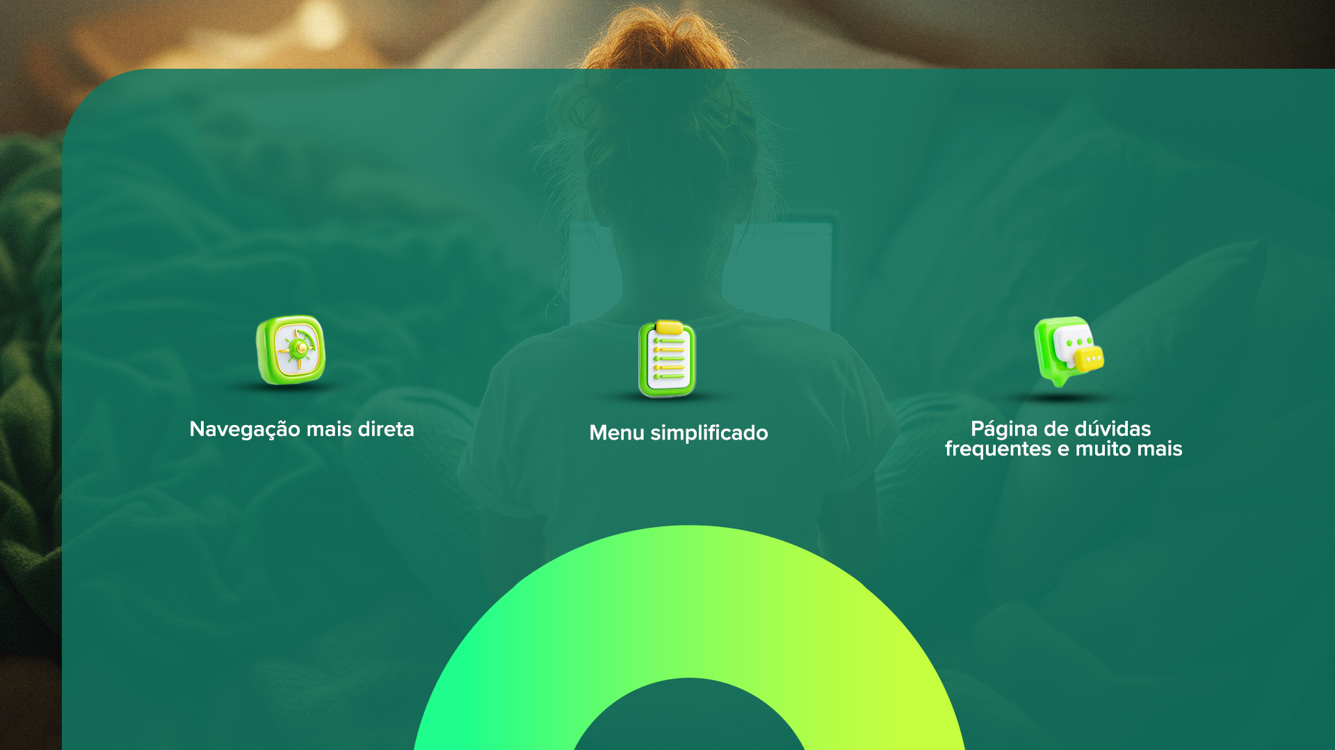
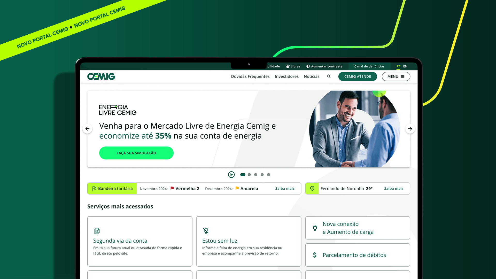
Cemig's new portal brought real improvements in navigation, accessibility, and usability for its users.
The communication challenge was precise: to transform a digital product launch, naturally technical and abstract, into something that any customer would understand as a concrete advantage in their daily life. The target audience was customers
Cemig for those over 25 in the state of Minas Gerais, and it required a welcoming, direct language without digital barriers.

The Strategy
Accessibility as a creative concept, not just a technical requirement.
The central decision was to treat accessibility as the creative axis of the campaign. This translated into the choice of people portrayed in the pieces:
diverse profiles, in real everyday contexts, interacting with technology naturally and effortlessly. The message “much easier”
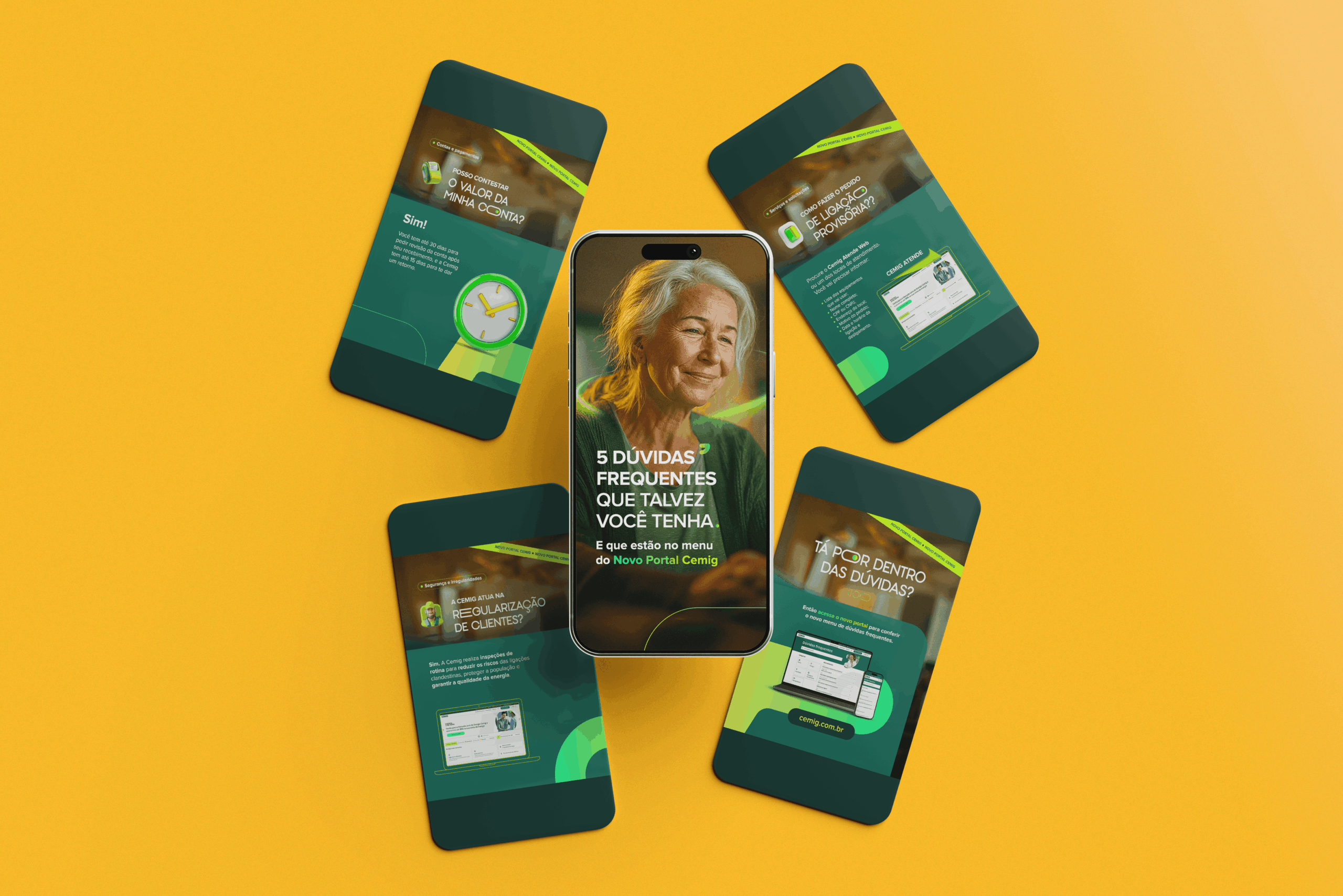
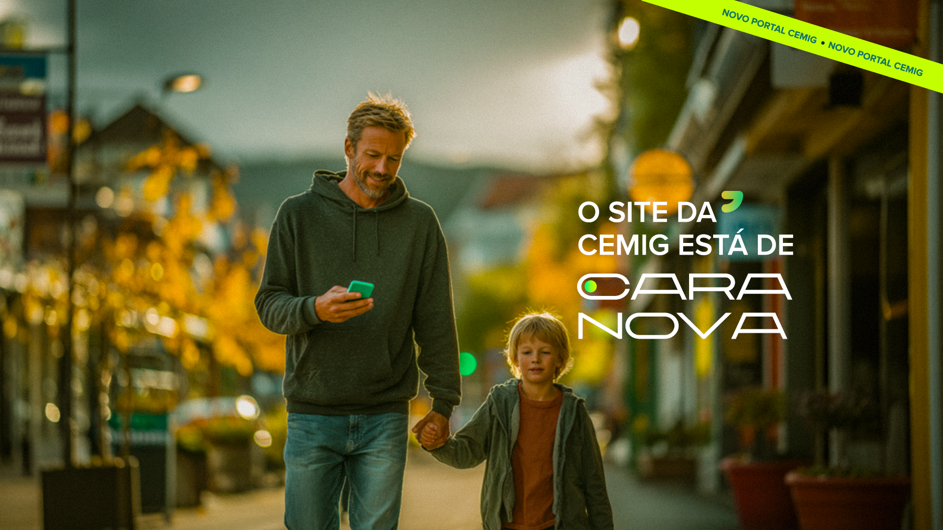
It wasn't just a headline. It was the criterion that guided every visual decision, from layout to the use of AI-generated images to ensure representation and production flexibility.
Scene generation with artificial intelligence support

Key Visual
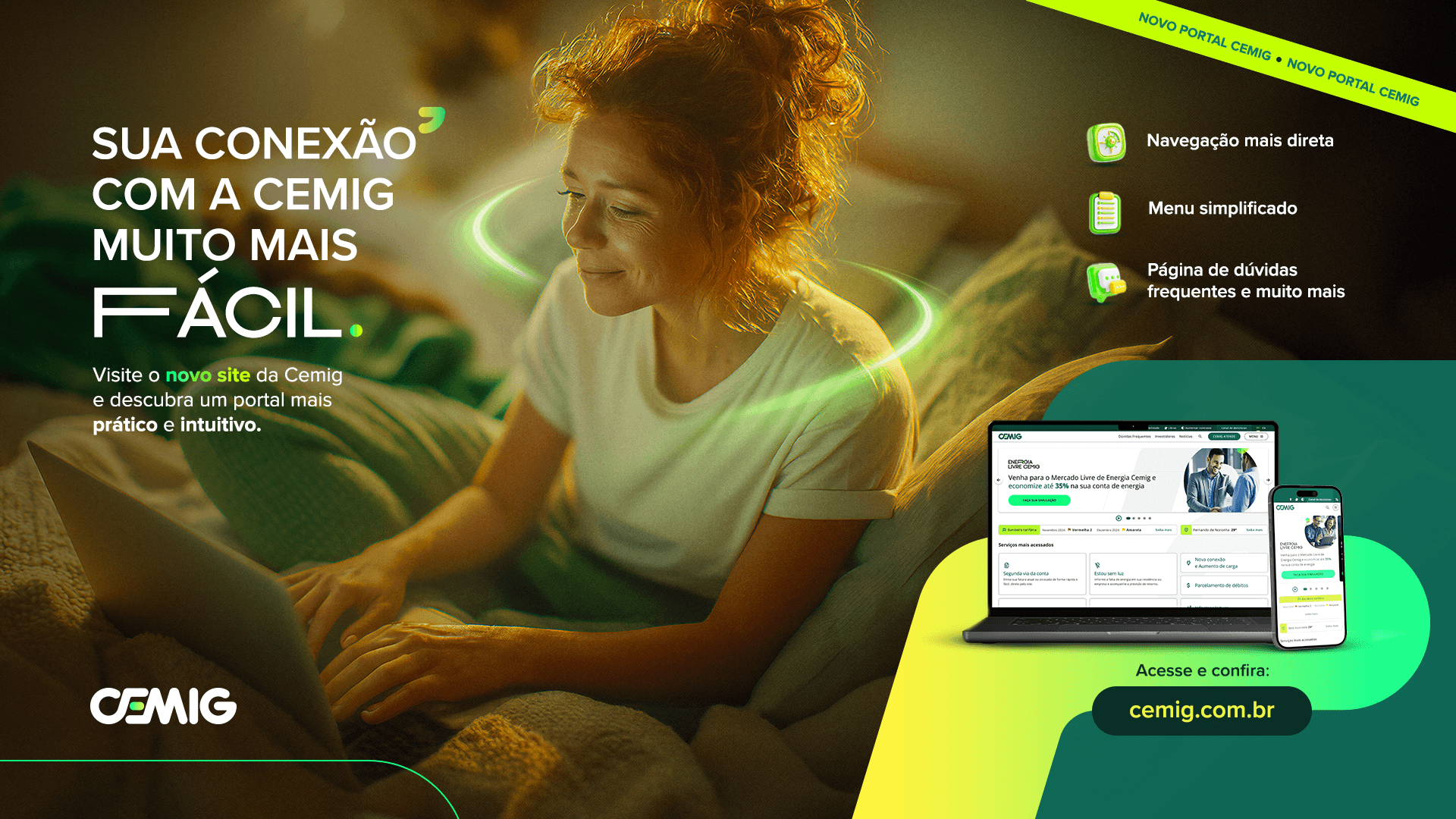
Technology that welcomes.
The composition was built by creating an intentional environment: a warm and cozy background in contrast with Cemig's technological and proprietary green.
This combination creates the feeling that innovation has arrived in the user's familiar environment. People didn't go to the portal. The portal came to them.
The green light around each persona reinforces this idea of technology as a gentle presence. A light that guides without pressuring.
We deliberately use older and middle-aged users: the new portal is not for a specific type of person. It is for any Cemig customer, regardless of their relationship with digital.
The portal's packshot within the ad serves a strategic function: it links the message to the real product, preventing the campaign from appearing generic.
The diagonal stripe at the top draws attention to the layout without competing with the main headline.